
To understand how web design is changing, it is first necessary to understand how web design technology has evolved, from the very first text & table based designs to the cutting edge designs we're now beginning to see with Web 3.0.
Wile opinions may vary amongst design professionals, it is generally agreed that we have gone through 3 Major iterations of web design; Web 1.0, Web 2.0 and now Web 3.0. Below are examples of each displayed in a Web 3.0 format leveraging HTML 5 and CSS 3.

Grid-based layouts using layering/ordering such as the one you're viewing (above) were simply not possible in Web 1.0. Nor was this interactive Accordian element.
It was around this time that Content Management Systems such as WordPress, Joomla, and Drupal became popular. Content Management Systems (CMS) replaced the self-written systems, which were error-prone and expensive to develop and maintain. These early CMS's had limited functionality but now it was possible for non-tecchies to create pages with a consistent style and layout without having to understand HTML, CSS and JavaScript.
Now thanks to WordPress and Joomla, anyone could create a blog or website. Today, more than 20% of sites are built using those systems. The systems such as WordPress and Joomla had always supported templates and themes, which now made it possible to modify the design without changing the content.
This spawned an entire industry whereby designers could provide ready-made themes that could be integrated into WordPress, Joomla, Drupal and other CMS systems.
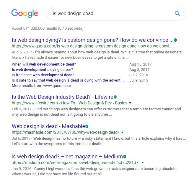
It would seem that everyone should be happy: web designers, developers, and Internet users. However, now there was a new problem. Web designers began to ask one question: "Is Web Design dead?".
You can find articles asking the same question on all known platforms, such are Medium, Mashable, SmashingMagazine, Quora, and Reddit. Since 2015, web designers have been asking the same question.
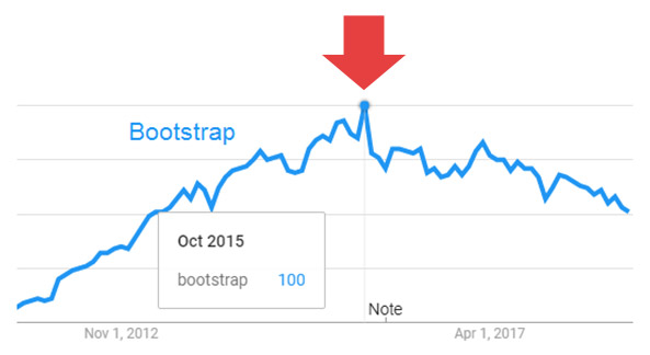
Bootstrap reached the height of its popularity in 2015-2016. You can see this in the Google Trends chart here.
The main reason for this problem was in Bootstrap and similar design tools. Bootstrap's web designs looked so similar to one another it was as if they were made with one template. Many website builders worsen the situation, having Bootstrap as the core of their systems.
Compared to Print design, Web design is still quite young. It is about two decades old. Print Design came long before web design, and it has hundreds of years of history. Print Design tools always allowed creatives to place items freely. Designers were not limited in their creativity. And publishers were always free in their ideas. They did not have to think about HTML, CSS, or mobile devices.
Nowadays, many print publishers have reduced print runs in favor of online distribution. Printed pages have become web pages but due to the restraints of design technology, much of the creativity and freed of print design was lost. Designers did not want to lose the print ideas they have collected for years. They began to design with print ideas online
The Print Design Formula: Free Positioning + Creativity = Modern Design
Trendy designs breaking stereotypes are becoming more popular. In the chart, you can see that every year more designers discover the world of Web Design 3.0. This chart displays the results on the topic of "web design" on Pinterest, Behance, and Dribbble. We forecast that this trend will continue in the future
This site is rated at 98% for page speed and mobile optimization
Find out how your site compares. It's more important than you think. Why It Matters >
We are way beyond simply "responsive" websites. Web 3.0 sites work on ANY device (Smartphones, Tablets, Laptops, Notebooks, even large TV screens such as those used for Digital signage. It's no longer necessary to build for a known screen size.
Web 3.0 pages don't just shrink in size to accomodate the users view screen. This technology allows for rearranging content as well as the ability to hide or display content based on screen size. No point in having a click-to-call button on a desktop right?
Unlike previous versions of html, Web 3.0 in conjuction with HTML 5 and CSS3 - Along with a bit of JavaScript magic is the perfect solution for designers.
Previous versions of HTML were very restrictive and cumberson, requiring designers to adhere to a very rigid table-like structure. Boot strap was better but still far from perfect.
With Web 3.0 we can now place elements with pixel-level precision, overlaps, adaptive grids, layers and even animation!
A 1 page visit to your website is a "Bounce". This typically means your users are not interacting with your site. Google and other search engines see this activity. If a website is not engaging or if the site visit is only a few seconds, this can significantly reduce your visibility online.
Page load speed and mobile-first design ensures that your visitors have an outstanding experience on your site, each and every time.
Google - and other search engines - know when you're using a mobile device. This adds yet another key ranking factor. If a user searches for your company from their smart phone, Google will often give preference to mobile-friendly Web3.0 sites over larger sites that are not mobile friendly, often resulting in better search engine placement.
Since Web 3.0 is optimized for mobile devices, the code is elegant and stream lined. Images are optimized for the fastest possible load speeds. HTML and CSS are "Minified" and 3rd party scripts are typically unnecessary resulting in light weight, fast loading pages, even over a slow cell connection.
Even the fonts and icon's are light weight!
Web 3.0 is as Google-Friendly as you can get. Did you know that Web 3.0 technologies supports Personal Web Apps? (PWA). With Web 3.0 you can deliver your website as a simple installable app so users can interact with your organization EVEN WHEN THEY DON'T HAVE INTERNET ACCESS!
PWA's reside locally on the user's phone. Your company, your brand, accessible as a clickable icon right on your users phone. Since web apps run locally, there is ZERO download time, apps are instantaneous!

 Hubspot
 Microsoft
 Google Adwords
 Google Analytics
20+ Years Experience in Web Design & Development, Digital Marketing, Lead Generation & Marketing Automation